After my first ski season in Japan, I decided to analyze the days I spent on the snow. Japanese design is well-known for it’s minimalism. I wanted to get my stats across in a similar simple way, using their flag as the starting point.
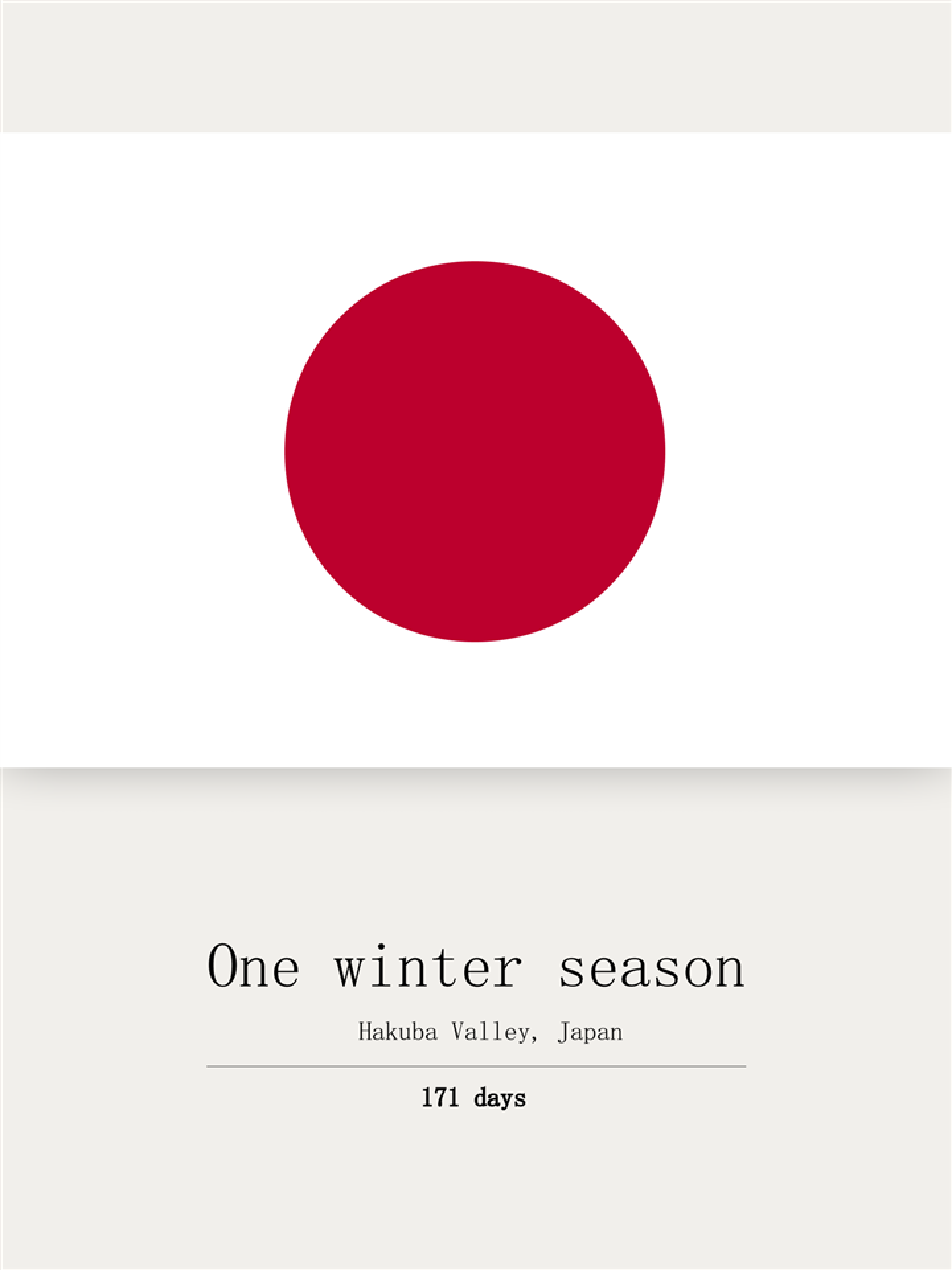
I spent 171 days in Japan during my first year and it seemed like a good place to start my part-to-whole visualization. I decided to use the flag’s red dot (which actually is not a dot, but represents the sun) as the ‘whole’ in my analysis.
Days on snow
A visual analysis of my first season in Japan
Before I did a full ski season, the most time I ever spent on the slopes in a year was around 25 days (which, in hindsight, is already crazy behaviour). Looking back after my first season, I was wondering by how much I beat that old record.
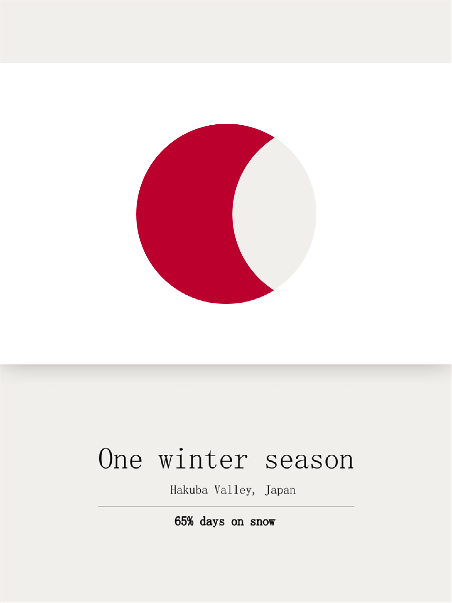
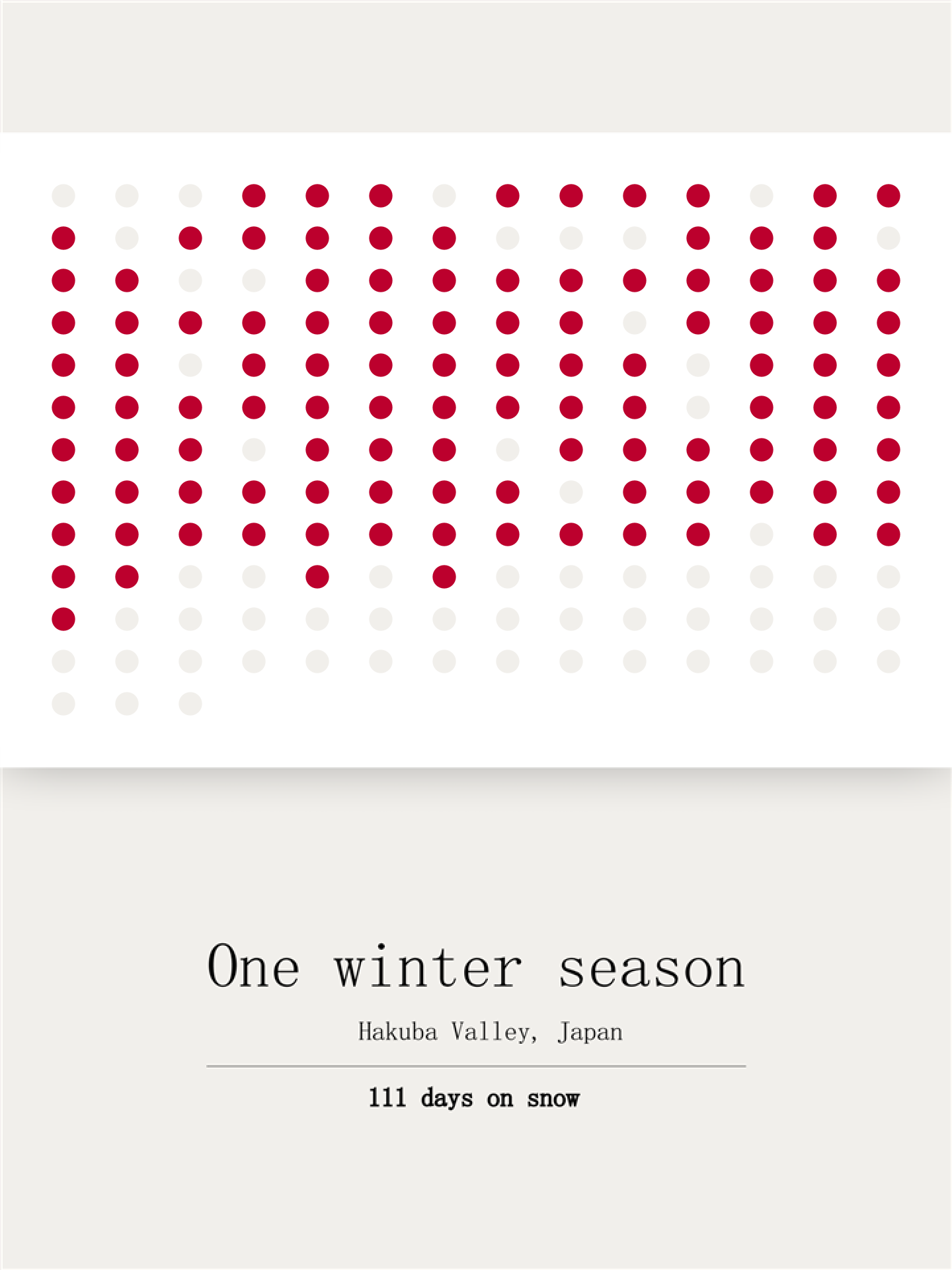
During my 6-month stay in Japan, I spent 65% of my days on snow, totaling 111 days. I must say, I'm quite proud of myself!
During my 6-month stay in Japan, I spent 65% of my days on snow, totaling 111 days. I must say, I'm quite proud of myself!
I also have a track record of transforming personal adventures into data visualization stories. I wrote a longer article about the idea behind self-quantified visualizations and why they matter to me.
Read it on The Viz Collective HERE.
Read it on The Viz Collective HERE.
Get in touch
julia.borsi@hey.com
Check my socials


julia.borsi@hey.com