From Kreischberg, with love

Collaboration with Ádám Incze
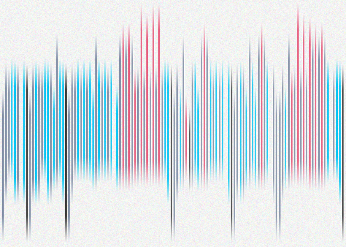
A postcard-like visualization consisting of multiple vertical lines quite close to each other in different length and colour, which are all data points from a snowboarding trip in Austria. Line colour shows slope difficulty (blue = beginner, red = intermediate, black = advanced; grey = ski lifts). Line position shows altitude, while length represents distance travelled.

A visualization created on a Sunday night with my then roommate and incredible friend, Ádám Incze.

This was the first time I used partially self-collected snowboarding data. I manually logged every lap I did on a ski trip back in 2019 in my phone’s Notes app and combined it with lift pass data (ski lift information and their timestamps), as well as slope elevation and length collected from the resort’s official website.

Our inspiration was the following art piece by Anne Lindberg:
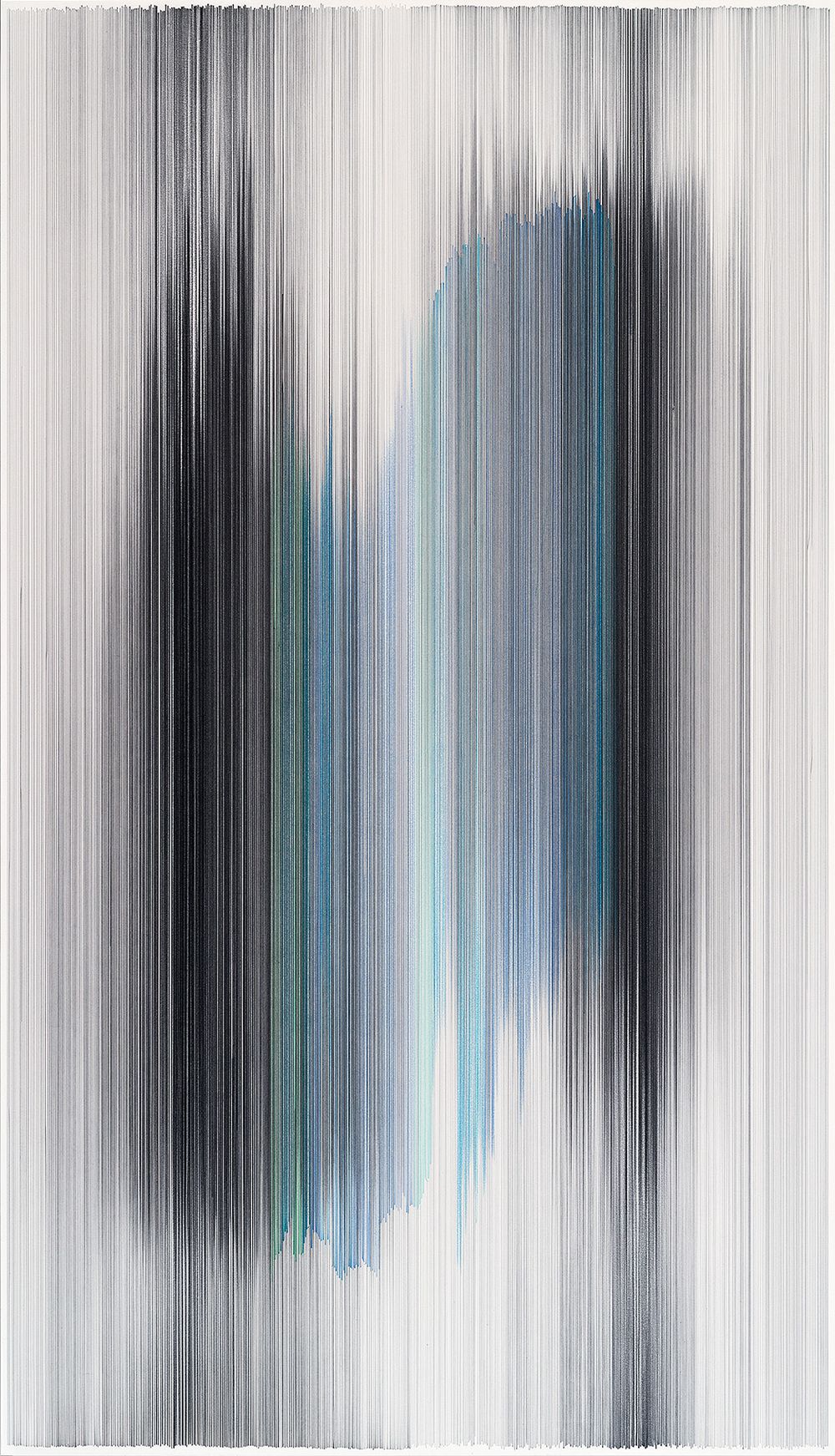
An artwork by Anne Lindberg that was my inspiration for the postcard design. In hers, the lines are horizontal, way more dense and of a darker colour.

We liked the idea of creating something similar, with actual meaning behind the lines, but without adding legends or explanations, so it would only make sense to us.

PS: The color of the lines indicates either the difficulty of the slopes (blue = beginner, red = intermediate, black = advanced) or grey for ski lifts. The starting position of each line shows how high I was on the mountain, and its length represents the distance travelled. Gaps between the lines show the start of a new day. But it doesn’t actually matter, does it?

Get in touch
julia.borsi@hey.com
Check my socials